Overview
Dashboards in ThreatConnect® display their content via a series of cards, and there are three types of cards you can add to a dashboard: Widget, Metric, and Query. When configuring a dashboard card, you can choose the card’s format, color scheme, and chart type to ensure the card displays data clearly and logically. After you add content to a dashboard, you can use the dashboard to elevate the most important information to yourself, your colleagues, and management with access to ThreatConnect.
Before You Start
User Roles
- To add content to custom dashboards you created or another user in your Organization shared, your user account can have any Organization role.
- To add content to System-level dashboards that are not built-in dashboards, your user account must have a System role of Administrator.
Prerequisites
- To add content to custom dashboards, turn on custom dashboards for your Organization on the Account Settings screen (must be an Accounts Administrator, Operations Administrator, or System Administrator to perform this action).
Dashboard Card Types
There are three types of cards you can add to a dashboard: Widget, Metric, and Query.
Widget
Widget cards are predefined dashboard cards that cannot be configured, other than to adjust their size and position on the dashboard. These cards are an effective way to quickly visualize and interact with your data. For example, the Start an Investigation Widget card lets you initiate a Browse screen query, while the Sources Widget card displays all of your owners organized by the Threat and Confidence Ratings of their Indicators.
Metric
Metric cards can be configured to display the following types of metrics:
- System Metricsare predefined by ThreatConnect and divided into three categories:
- Activities provides a graphical representation of changes in activity for selected data types (e.g., Observations, False Positives, Tags, Attributes, Average Indicator Confidence Rating) within the selected owners over a period of time.
- Indicators provides a graphical representation of the addition of selected Indicator types within the selected owners over a period of time.
- Intelligence provides a graphical representation of the addition of selected Group types within the selected owners over a period of time.
- User Metrics are custom metrics created by Organization Administrators.
- Cases Metrics provide a graphical representation of nine metrics for Workflow Cases in your Organization: Active Cases, Analyst Workload, False Positives, Mean Time to Detection (MTTD), MTTD Average, Mean Time to Resolution (MTTR), MTTR Average, Top 10 Case Closing Analyst, and Unassigned Cases.
- Playbooks Metrics provide a graphical representation of three metrics calculated by the Playbooks Return on Investment feature for all selected Playbooks: Playbook Execution Count, Playbook Financial Savings, and Playbook Hours Saved.
Query
Query cards let you display the results of newly created or saved queries written in ThreatConnect Query Language (TQL).
Adding Cards to a Dashboard
Follow these steps to add cards to a dashboard:
- Hover over Dashboard on the top navigation bar and select an existing dashboard to open or create a custom dashboard.
- Click Add
 at the upper-right corner of the dashboard, or click Add Your First Card in the middle of the dashboard if no cards have been added to it.
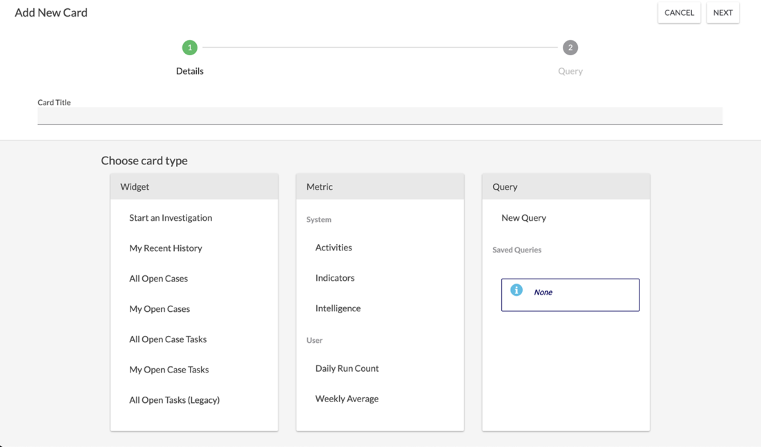
 - On the Details step of the Add New Card drawer (Figure 1), enter a title for the card, and then select a card from the Widget, Metric, or Query section. If you do not enter a title for the card before selecting it, the name of the selected card (e.g., My Recent History) will be set as the card’s title.NoteTo view a complete list of Widget and Metric cards, scroll down the Widget and Metric sections, respectively.
- If you selected a Widget card, it will be added to the dashboard automatically and no further configuration will be required. If you selected a Metric or Query card, you will proceed to the Query step of the Add New Card drawer automatically. On this step, configure the data to display on the card. Then click NEXT at the top right of the drawer to proceed to the Options step.
- On the Options step of the Add New Card drawer for Metric and Query cards, configure the card’s appearance. Then click SAVE at the top right of the drawer to add the card to the dashboard.
Repeat this process for each card you want to add to a dashboard.
ThreatConnect® is a registered trademark of ThreatConnect, Inc.
20044-04 v.16.A