Overview
When working with Groups and Indicators in ThreatConnect®, you can use the Custom View tab on the Details screen to display a customized view of the data that matter most to you, allowing you to make decisions more quickly during an investigation involving these object types. Each ThreatConnect user can configure two Custom View tabs for their user account: one for all Groups in all of their owners, and one for all Indicators in all of their owners.
As you configure the Custom View tab for Groups or Indicators, you can customize the tab’s layout, select which cards to show on the tab, and specify whether to display the tab by default each time you open the Details screen. After you configure a Custom View tab, you can export the tab’s configuration and share it with other users so that they can import it into their user account.
Before You Start
User Roles
- To access and manage the Custom View tab for Groups and Indicators, your user account can have any Organization role.
- To export and import Custom View tab configuration files, your user account can have any Organization role.
- To set a custom view as the Organization’s default custom view, your user account must have an Organization role of Organization Administrator.
Prerequisites
- For the Tags Across Owners card to be available to add to the Indicator: Custom View tab, turn on the multiSourceViewEnabled system setting (must be a System Administrator to perform this action).
Accessing and Managing a Custom View Tab
Follow the steps in this section to access and configure the Group: Custom View and Indicator: Custom View tabs on the Details screen for Groups and Indicators, respectively.
- Navigate to the Details screen for a Group or an Indicator.
- Select the Custom View tab. If you are accessing this tab for the first time, it will display no cards.
- Click Manage View on the Custom View tab to open the Manage View drawer (Figure 1). Then use the following options to configure the Custom View tab:
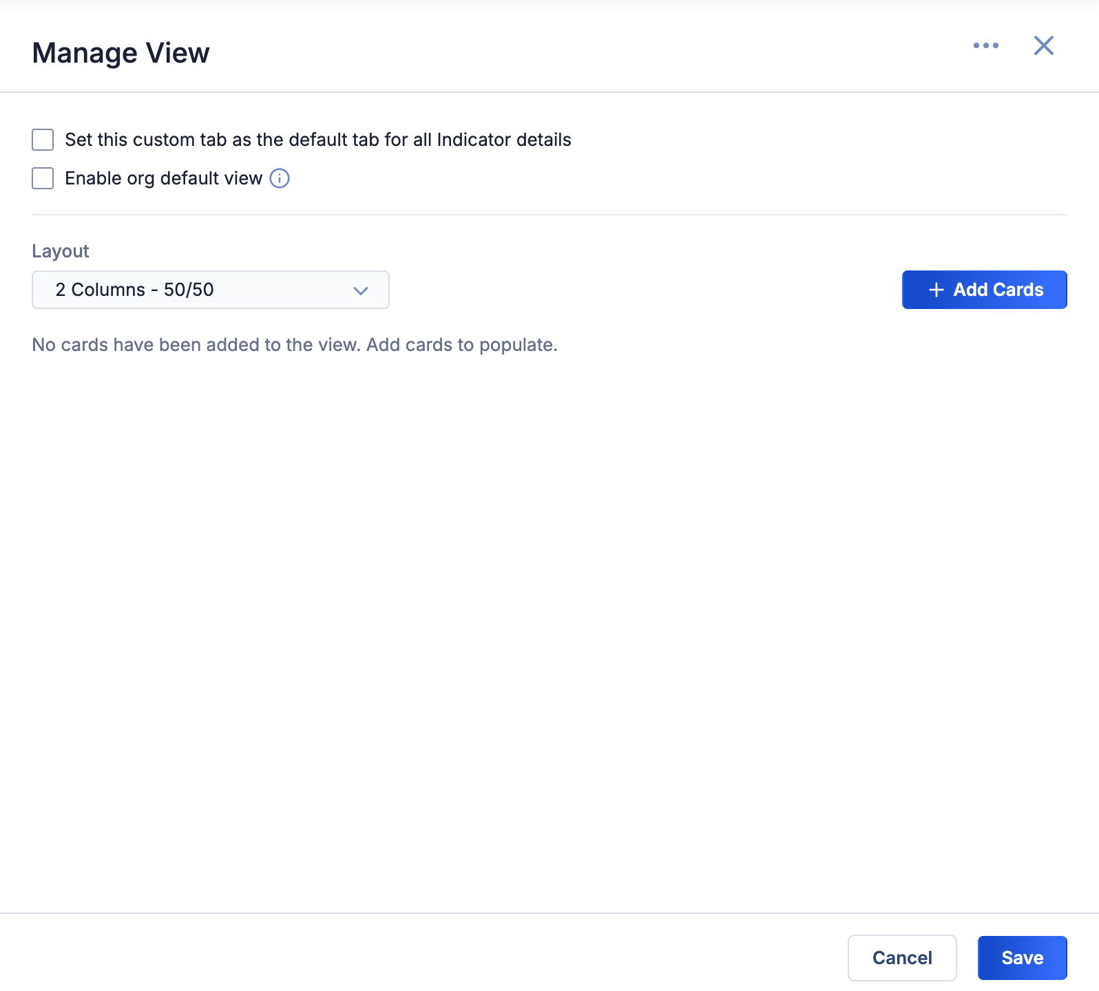
- Set this custom tab as the default tab for all <object type> details: (Optional) Select this checkbox to display the Custom View tab instead of the Overview tab when you open the Details screen for the corresponding object type (Indicator in this example).
- Enable org default view: If a default custom view has been set for the corresponding object type in your Organization, select this checkbox to use the Organization’s default custom view. If this checkbox is selected, clear it to use your last saved custom view.NoteYou cannot edit the contents or layout of the Organization’s default custom view using the Manage View drawer.NoteIf a default custom view has not been set for the corresponding object type in your Organization, the Enable org default view checkbox will be grayed out.
- Layout: Select the layout of the Custom View tab.
- + Add Cards: Click this button to add cards to the Custom View tab.
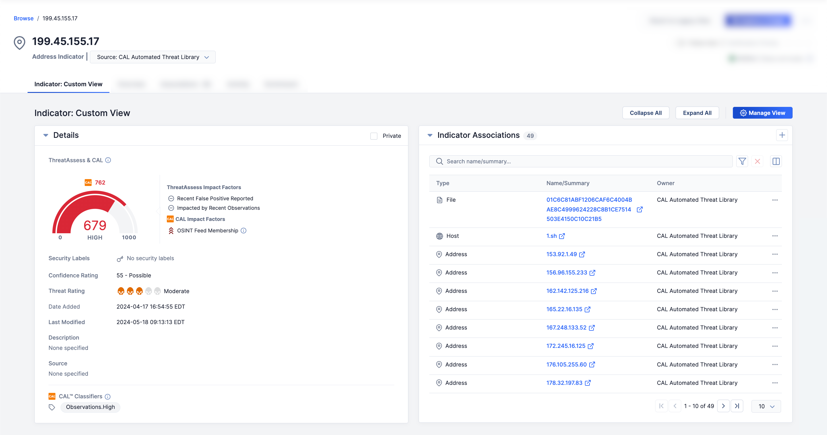
- After you have made all desired changes to the Custom View tab, click Save on the Manage View drawer. The Custom View tab will now display all cards added to it in the selected layout (Figure 2).
 NoteIf you are viewing an Indicator that does not exist in your Organization and your user account has an Organization role of Standard User, Sharing User, Organization Administrator, or App Developer, the Indicator’s Details screen will display a message stating the Indicator does not exist in your Organization and provide a link to create a copy of the Indicator in your Organization. If you click this link, the Details screen will show details for the copy of the Indicator in your Organization after it is created. In addition, if your System Administrator turned on the multiSourceViewEnabled system setting, your Organization will be listed on the Tags Across Owners card for the Indicator in addition to the Indicator’s other owners to which you have access.
Selecting a Custom View Tab Layout
When managing a Custom View tab, you can select one of the following tab layout options from the Layout dropdown on the Manage View drawer (Figure 1):
- 1 Column - 100: One-column layout that takes up 100% of the available width
- 2 Columns - 50/50 (default): Two-column layout where each column takes up 50% of the available width
- 2 Columns - 60/40: Two-column layout where the leftmost column takes up 60% of the available width and the rightmost column takes up the remaining 40%
- 2 Columns - 40/60: Two-column layout where the leftmost column takes up 40% of the available width and the rightmost column takes up the remaining 60%
Adding Cards to a Custom View Tab
A Custom View tab consists of one or more cards that display a variety of data that belong to the object whose Details screen you are viewing. When managing a Custom View tab, you can configure which cards to display on the tab and organize the layout of the cards via the Manage View drawer (Figure 1).
- On the Manage View drawer, click + Add Cards to open the Add Cards window (Figure 3). This window shows all cards not added to the Custom View tab for the object type (Indicator in this example). In addition, the Applicable Types column shows the object types for which each card is available.NoteIf you added all available cards to a Custom View tab, the + Add Cards button will be grayed out.
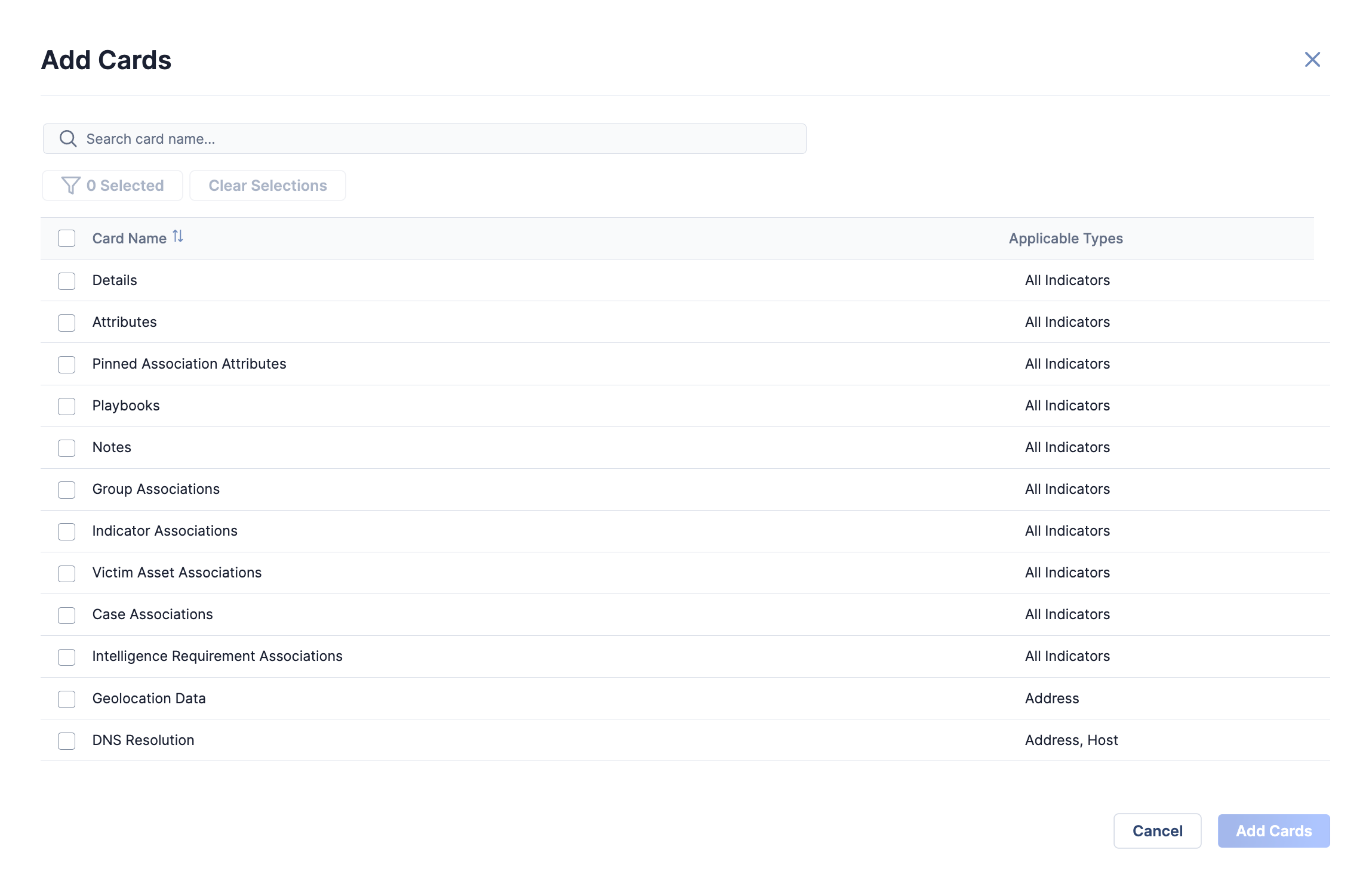
- Select one or more cards to add to the Custom View tab. As you select cards, the Selected button at the top left of the window will update to reflect the current number of selected items. When at least one card is selected, you can click the Selected or Clear Selectionbutton to view only the selected items or clear all selections, respectively.NoteTo select all available cards, select the checkbox in the table header.
- Click the Add Cards button.
- Select one or more cards to add to the Custom View tab. As you select cards, the Selected button at the top left of the window will update to reflect the current number of selected items. When at least one card is selected, you can click the Selected or Clear Selectionbutton to view only the selected items or clear all selections, respectively.
- The Manage View drawer will display the cards selected on the Add Cards window (Figure 4). Here, you can organize the order of the cards on the Custom View tab by clicking and dragging cards to the desired position. If you selected a two-column layout for the Custom View tab, you can also click and drag cards to the desired column. To remove a card from the layout, click Delete
 on the card.
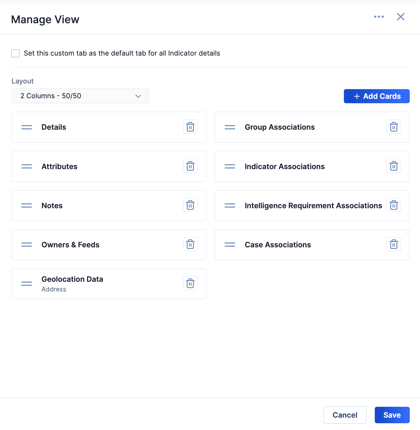
 on an association-based card to manage which table columns the card will display.
Available Cards for Indicators
See Table 1 for a list of cards you can add to the Indicator: Custom View tab on the Details screen for Indicators.
| Card Name | Corresponding Details Screen Card | Applicable Indicator Type(s) |
|---|---|---|
| Attributes | Attributes card on the Overview tab | All |
| Case Associations | Case Associations card on the Associations tab | All |
| Details | Details card on the Overview tab | All |
| DNS Resolution | DNS Resolution card on the Overview tab | Address; Host |
| DomainTools | DomainTools card on the Enrichment tab | Host |
| Farsight Passive DNS | Farsight Passive DNS card on the Enrichment tab | Address; Host |
| File Hash Details | File Hash Details card on the Overview tab | File |
| GeoLocation Data | GeoLocation Data card on the Overview tab | Address |
| Group Associations | Group Associations card on the Associations tab | All |
| Indicator Associations | Indicator Associations card on the Associations tab | All |
| Intelligence Requirement Associations | Intelligence Requirement Associations card on the Associations tab | All |
| Investigation Links | Investigation Links card on the Overview tab | All |
| Known File Occurrences | Known File Occurrences card on the Overview tab | File |
| Notes | Notes card on the Overview tab | All |
| Observations, False Positives, & Impressions | Observations, False Positives, & Impressions card on the Overview tab | All |
| Owners & Feeds | Owners & Feeds card on the Overview tab | All |
| Pinned Association Attributes | Pinned Association Attributes card on the Overview tab | All |
| Playbooks | Playbooks card on the Overview tab | All |
| Shodan | Shodan card on the Enrichment tab | Address |
| Tags Across Owners1 | Tags Across Owners card on the Overview tab | All |
| URLScan | URLScan card on the Enrichment tab | URL |
| Victim Asset Associations | Victim Asset Associations card on the Associations tab | All |
| VirusTotal | VirusTotal card on the Enrichment tab | Address; File; Host; URL |
| Whois | Whois card on the Overview tab | Host |
1 The Tags Across Owners card, which is a beta feature as of ThreatConnect 7.6, will be available to add to the Indicator: Custom View tab only if your System Administrator turned on the multiSourceViewEnabled system setting.
Available Cards for Groups
See Table 2 for a list of cards you can add to the Group: Custom View tab on the Details screen for Groups.
| Card Name | Corresponding Details Screen Card | Applicable Group Type(s) |
|---|---|---|
| Attributes | Attributes card on the Overview tab | All |
| Case Associations | Case Associations card on the Associations tab | All |
| Details | Details card on the Overview tab | All |
| Document File | Document File card on the Overview tab | Document |
| Group Associations | Group Associations card on the Associations tab | All |
| Indicator Associations | Indicator Associations card on the Associations tab | All |
| Intelligence Requirement Associations | Intelligence Requirement Associations card on the Associations tab | All |
| Notes | Notes card on the Overview tab | All |
| Pinned Association Attributes | Pinned Association Attributes card on the Overview tab | All |
| Playbooks | Playbooks card on the Overview tab | All |
| Report File | Report File card on the Overview tab | Report |
| TQL Queries | TQL Queries card on the Associations tab | All |
| Victim Asset Associations | Victim Asset Associations card on the Associations tab | All |
Exporting and Importing Custom View Tabs
After you configure a Custom View tab, you can export the tab’s configuration to a .tccv file. Other ThreatConnect users can then use the .tccv file to import the Custom View tab’s configuration into their user account.
Exporting a Custom View Tab
Follow these steps to export a Custom View tab’s configuration:
- Navigate to the Details screen for a Group or an Indicator.
- Select the Custom View tab. Then click Manage View to open the Manage View drawer.
- Click the ⋯ menu at the top right of the Manage View drawer and select Export View to export the Custom View tab’s configuration to a .tccv file.WarningDo not modify the contents of a .tccv file. Otherwise, users may encounter errors when trying to import the file into ThreatConnect.
Importing a Custom View Tab
Follow these steps to import a Custom View tab’s configuration with a .tccv file:
- Navigate to the Details screen for a Group or an Indicator.
- Select the Custom View tab. Then click Manage View to open the Manage View drawer.
- Click the ⋯ menu at the top right of the Manage View drawer and select Import View. Then locate and select a .tccv file to import. After the file is imported, the Manage View drawer will display the Custom View tab’s configuration, including its layout and cards.
- Click Save on the Manage View drawer to save the imported Custom View tab’s configuration to your user account.
Setting a Default Custom View For Your Organization
Organization Administrators can set and manage default custom views that are available to all users in their Organization. Once a default custom view is set for an Organization, users in the Organization can choose whether to use the Organization’s default view instead of setting up their own custom view via the Enable org default view option in the Manage View drawer (Figure 1).
There are two places where an Organization Administrator can set a default custom view for their Organization: the Manage View drawer and the Default Custom Views tab of the Organization Config screen.
Setting a Default Custom View on the Manage View Drawer
Follow these steps to set a default custom view for your Organization on the Manage View drawer:
- Log into ThreatConnect with an Organization Administrator account.
- Navigate to the Details screen for a Group or an Indicator.
- Select the Custom View tab. Then click Manage View to open the Manage View drawer.
- Configure the default custom view by selecting the layout of and adding cards to the Custom View tab.
- Click the ⋯ menu at the top right of the Manage View drawer and select Set View as Org Default.
Setting a Default Custom View on the Default Custom Views Tab
Follow these steps to set a default custom view for your Organization on the Default Custom Views tab of the Organization Config screen:
- Log into ThreatConnect with an Organization Administrator account.
- Configure the custom view that you want to set as the default custom view for your Organization.
- Export the custom view as a .tccv file.
- Hover over Settings
 on the top navigation bar and select Org Config. Then select the Default Custom Views tab.
 - Upload the .tccv file in the Indicator Org Default View or Group Org Default View section on the Default Custom Views tab to set a default custom view for Indicators or Groups, respectively.
in the Indicator Org Default View or Group Org Default View section on the Default Custom Views tab. Note that the default custom view will be removed immediately and you will not be prompted for confirmation. Also, any users in your Organization that were using the default custom view will no longer have access to it on the Custom View tab for the corresponding object type (Indicator or Group).ThreatConnect® is a registered trademark of ThreatConnect, Inc.
DomainTools® and Farsight Security® are registered trademarks of DomainTools, LLC.
VirusTotal™ is a trademark of Google, Inc.
RiskIQ® is a registered trademark of Microsoft Corporation.
Shodan® is a registered trademark of Shodan.
20162-01 v.03.A