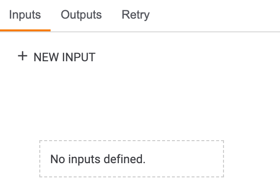
The Inputs tab (Figure 1) is where you can determine and manage an App’s input parameters (i.e., the fields that are viewed in the configuration pane for the App in the Playbook Designer).
Creating Input Parameters
To create a new input parameter, click the + NEW INPUT button on the Inputs tab. The Create Parameter: drawer will be displayed on the left side of the screen (Figure 2).
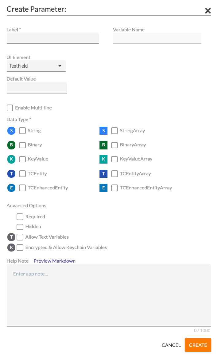
- Label: Enter a name for the parameter. This is the name that will be displayed to users of the App.
- Variable Name: This field will autofill the name of the corresponding input variable for the parameter, based on the provided label. For example, if the label is “Sample Input Parameter”, then the Variable Name will fill as “sample_input_parameter”. This field may not be edited.
- UI Element: Use the dropdown list to select the type of element (TextField, Editable Choice, Dropdown, Checkbox, Multiselect Dropdown, or Key/Value List) that will render for this parameter in the Edit App pane in the Playbook Designer.NoteThe choice of UI Element will determine the rest of the fields that you can configure in the Create Parameter: section. For example, selecting TextField allows you to configure the Default Value, Enable Multi-line, Data Type, Required, Hidden, Allow Text Variables, and Encrypted & Allow Keychain Variables options, whereas selecting Checkbox allows you to configure only the Default Value and Hidden options, and all remaining options will be grayed out.
- TextField (Figure 2)
- Default Value: Enter a default value that will be displayed for the parameter in the Edit App pane of the Playbook Designer when configuring the App, if desired.
- Enable Multi-line: Select the checkbox to display a TextField input field with multiple lines in the Edit App pane of the Playbook Designer when configuring the App.
- Data Type: Select one or more types of data that the parameter will take. These data types are the kinds of variables that users designing Playbooks that utilize the App will be allowed to enter. The letter to the left of each selection provides a quick reference to the type of data, with the array versions of a data type having the same letter as the non-array versions (e.g., both String and StringArray are represented by “S”), but appearing in a square instead of a circle.
- Required: Select the checkbox to require users to enter a value for this parameter.
- Hidden: Select this checkbox if the parameter should be a hidden parameter. A hidden parameter is a parameter that is not visible when configuring the App in a Playbook.
- Allow Text Variables: Select the checkbox to allow text variables to be entered as values for this parameter.
- Encrypted & Allow Keychain Variables: Select the checkbox to enable encryption and allow keychain variables to be entered as values for this parameter.
- Allow File Variables: If Binary or BinaryArray is selected as the Data Type, then this checkbox will be displayed in place of the Allow Text Variables and Encrypted & Allow Keychain Variables checkboxes. Select this checkbox to allow file variables to be entered as values for this parameter.
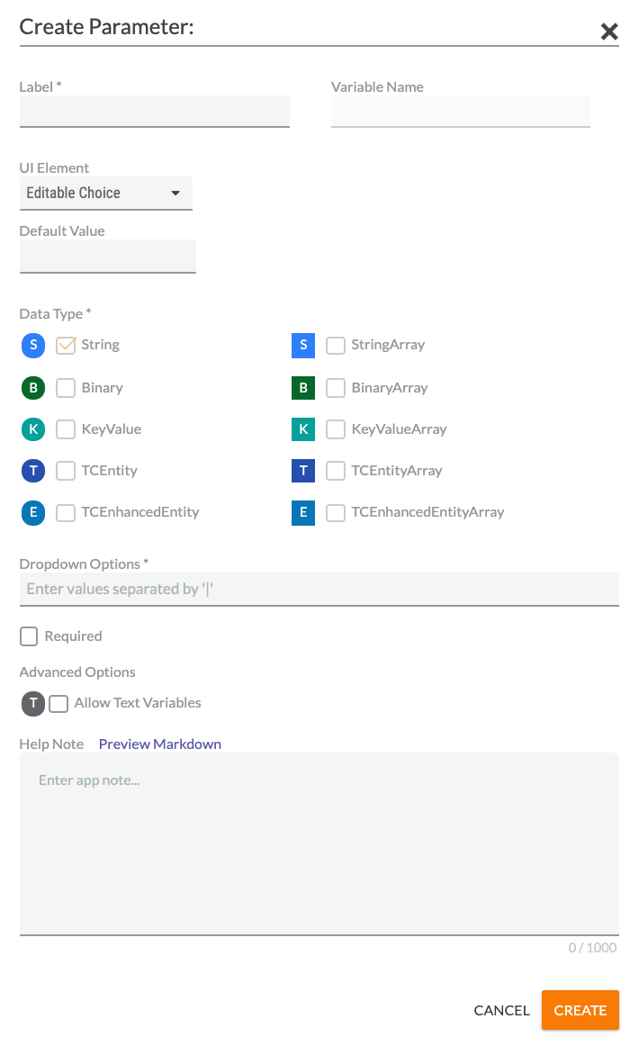
- Editable Choice (Figure 3)
- Default Value: Enter a default value that will be displayed for the parameter in the Edit App pane of the Playbook Designer when configuring the App, if desired.
- Dropdown Options: Enter pipe-delimited (|) dropdown options that users will choose from in the Edit App pane of the Playbook Designer when configuring the App.
- Required: Select the checkbox to require users to select a value for this parameter.
- Allow Text Variables: Select the checkbox to allow text variables to be entered as values for this parameter.
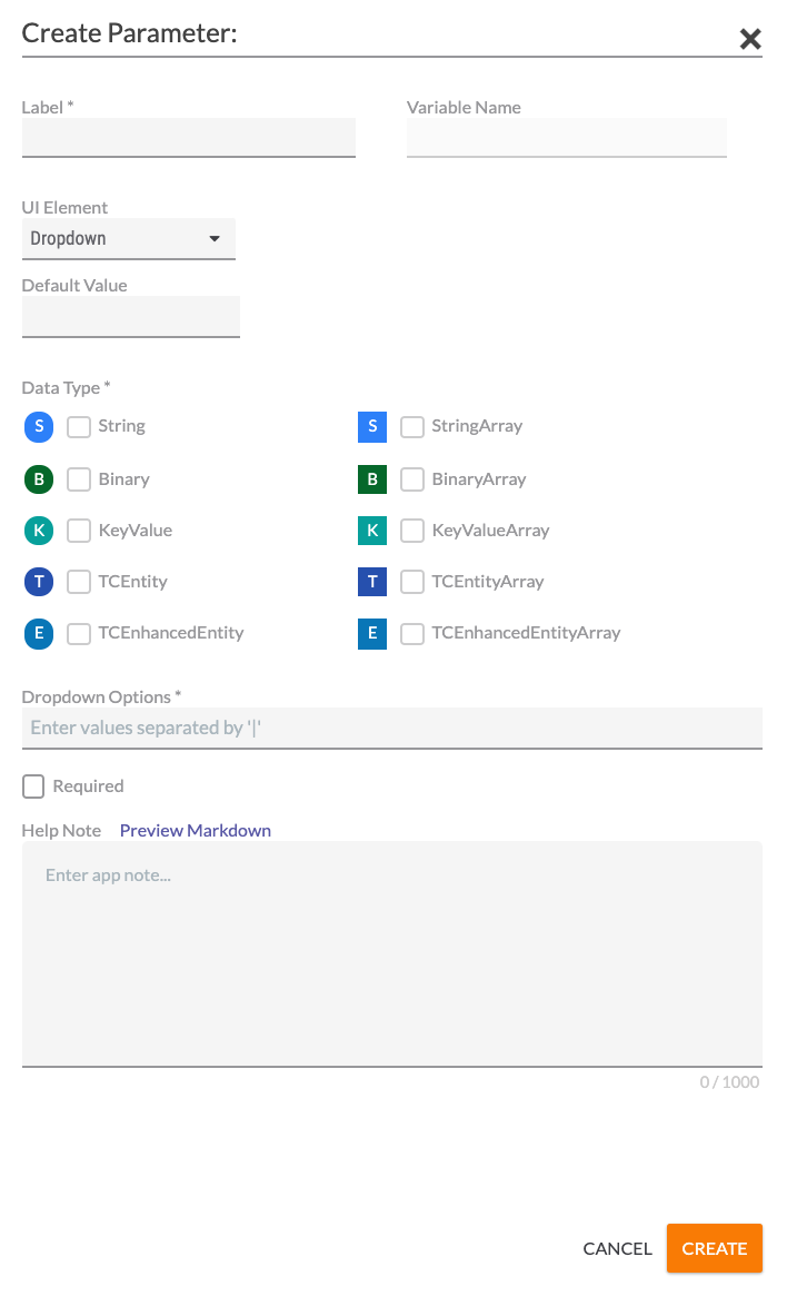
- Dropdown(Figure 4)
- Default Value: Enter a default value that will be displayed for the parameter in the Edit App pane of the Playbook Designer when configuring the App , if desired.
- Dropdown Options: Enter pipe-delimited (|) dropdown options that users will choose from in the Edit App pane of the Playbook Designer when configuring the App.
- Required: Select the checkbox to require users to select a value for this parameter.
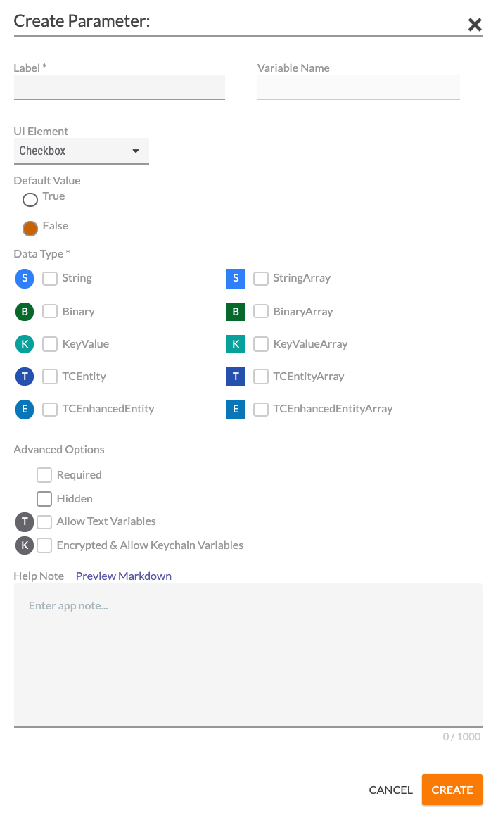
- Checkbox (Figure 5)
- Default Value: Specify whether the Checkbox parameter will be selected (True) or cleared (False) by default.
- Hidden: Select this checkbox if the parameter should be a hidden parameter. A hidden parameter is a parameter that is not visible when configuring the App in a Playbook.
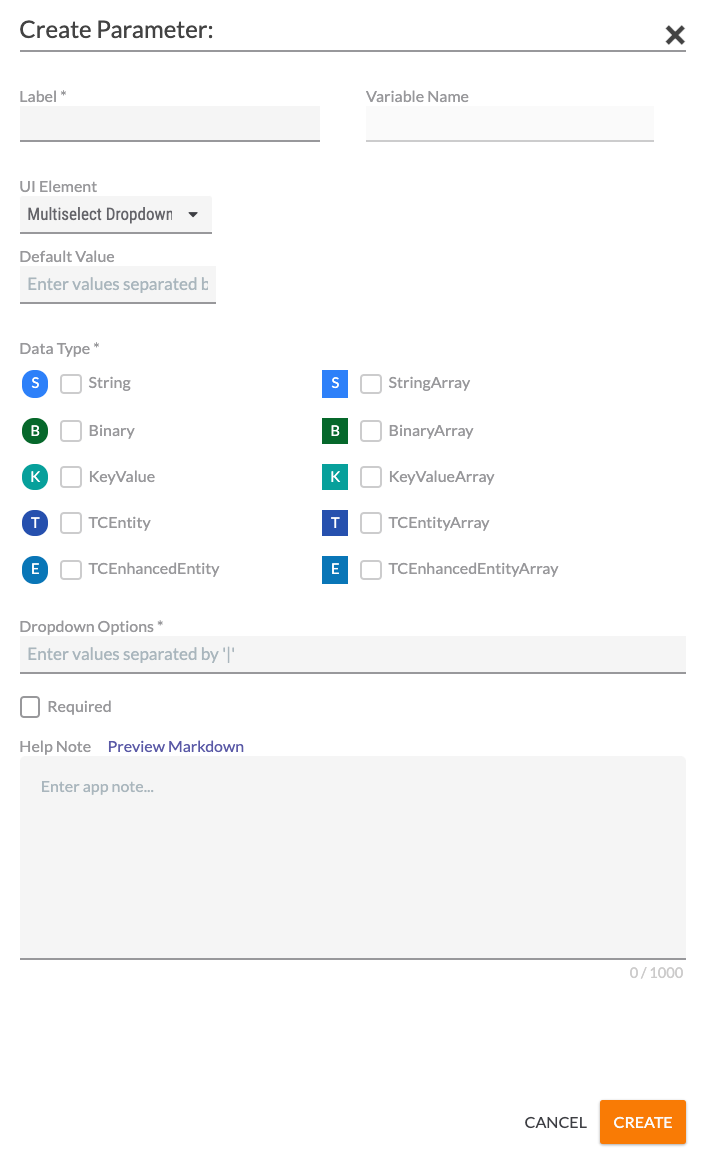
- Multiselect Dropdown (Figure 6)
- Default Value: Enter a default value that will be displayed for the parameter in the Edit App pane of the Playbook Designer when configuring the App, if desired. Multiple values separated by the pipe (|) character may be entered as default values.
- Dropdown Options: Enter pipe-delimited dropdown options that users will choose from in the Edit App pane of the Playbook Designer when configuring the App.
- Required: Select the checkbox to require users to select a value for this parameter.
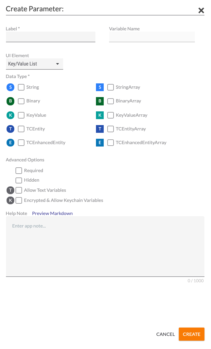
- Key/Value List (Figure 7)
- Data Type: Select one or more types of data that the parameter will take. These data types are the kinds of variables that users designing Playbooks that utilize the App will be allowed to enter. The letter to the left of each selection provides a quick reference to the type of data, with the array versions of a data type having the same letter as the non-array versions (e.g., both String and StringArray are represented by “S”), but appearing in a square instead of a circle.
- Required: Select the checkbox to require users to enter a value for this parameter.
- Hidden: Select this checkbox if the parameter should be a hidden parameter. A hidden parameter is a parameter that is not visible when configuring the App in a Playbook.
- Allow Text Variables: Select the checkbox to allow text variables to be entered as values for this parameter.
- Encrypted & Allow Keychain Variables: Select the checkbox to enable encryption and allow keychain variables to be entered as values for this parameter.
- Allow File Variables: If Binary or BinaryArray is selected as the Data Type, then this checkbox will be displayed in place of the Allow Text Variables and Encrypted & Allow Keychain Variables checkboxes. Select this checkbox to allow file variables to be entered as values for this parameter.
- TextField (Figure 2)
- Help Note: Text entered here will be displayed in the Inputs section of the App Note, which is the text that is displayed when Display Documentation
 is clicked in the Edit App pane of the Playbook Designer when configuring the App. To preview the note in Markdown, click the Preview Markdown link.
 - Click the CREATE button to create the parameter.
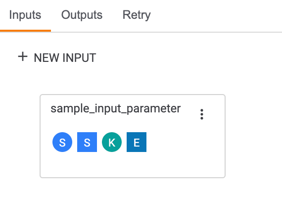
The parameter will be displayed on the Inputs tab, along with letter representations of the data types it accepts (Figure 8).
Hovering over the parameter will display the Insert Code icon. To insert the parameter into the Code Editor, position the cursor in the desired location in the Code Editor and click Insert Code. For example, in Figure 9, the sample parameter was inserted on line 23.
functionality employs snippets to place input parameters into the Code Editor. Because snippets are available only to Apps that use TcEx 4.0.x, the Insert Codeicon will not be displayed when you hover over an input parameter when working with Apps that use a TcEx version older than 4.0.x. In this scenario, you must manually write the code that references the input parameter in the Code Editor in order to use the parameter in the App. To determine an App's TcEx version, refer to the App's requirements.txt file located in the Contents tab.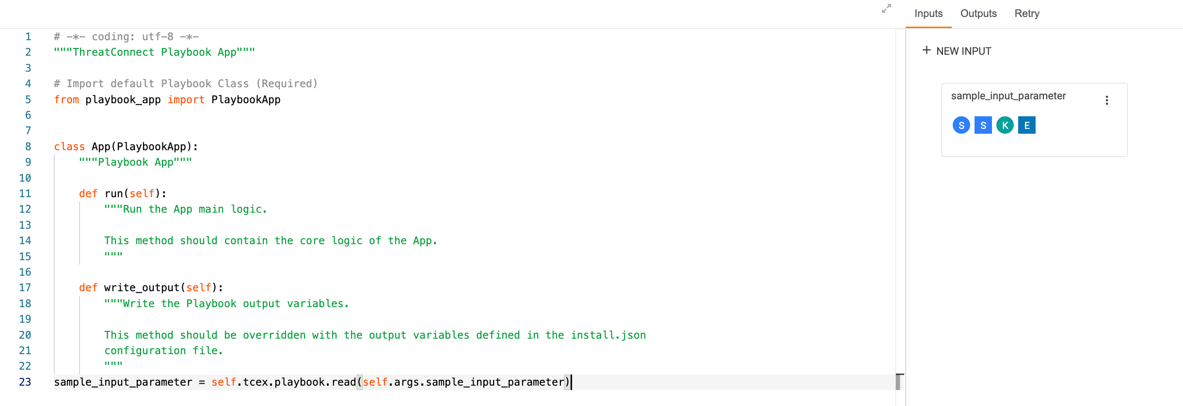
Managing Input Parameters
Click the vertical ellipsis to the right of the parameter name in the Inputs tab to display options for editing or deleting the parameter.
Editing Input Parameters
Select Edit to edit the parameter. The Edit Parameter: drawer will be displayed (Figure 10).
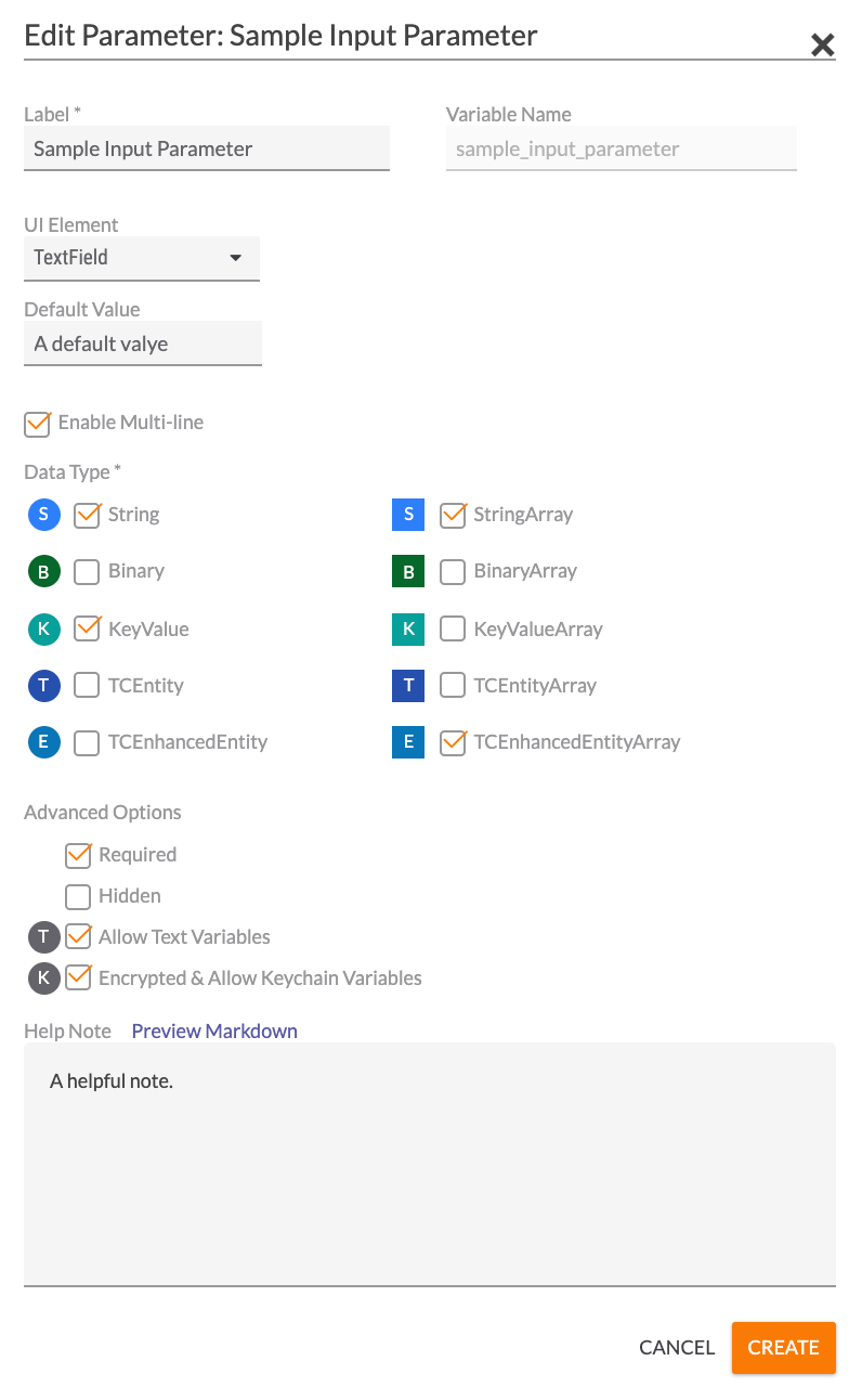
- Make any desired changes to the parameter.
- Click the CREATE button.
Deleting Input Parameters
Select Delete to delete the parameter. If code for an input parameter has been inserted into the Code Editor and then the parameter is deleted, the inserted code will remain.
ThreatConnect® is a registered trademark of ThreatConnect, Inc.
20084-10 v.07.B