- On the top navigation bar, click Playbooks to display the Playbooks screen of the Playbooks tab (Figure 1). Components are indicated by the
 icon in the Type column.
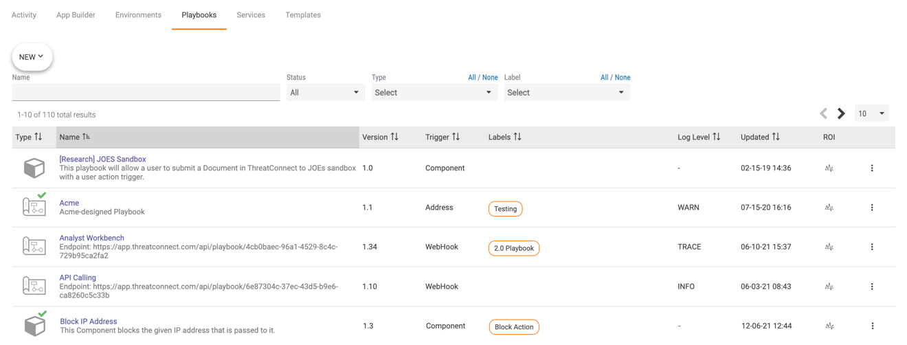
- Hover over the NEW button at the upper-left corner of the Playbooks screen, and select Create Playbook from the dropdown menu that is displayed. The Create Playbook window will be displayed (Figure 2).
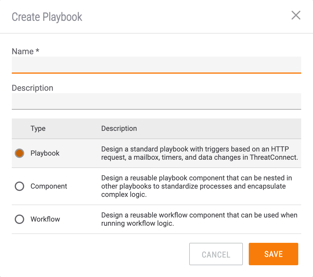
- Name: Enter a name for the Component
- Description: Enter an optional description of the Component.ImportantIt is recommended that you enter a description, as the description defines what the Component does and will be in the Display Documentation information for the Component when adding it to a Playbook and editing its parameters.
- Type: Select Component.
- Click the SAVE button.
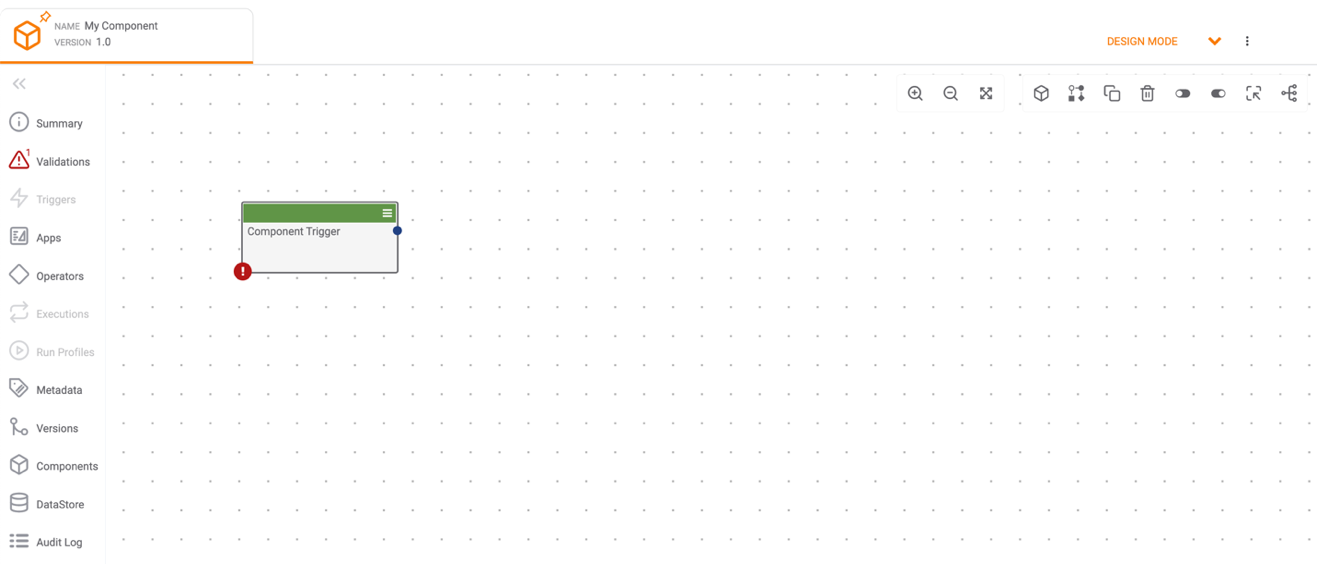
- The Playbook Designer will automatically open for the new Component, and a Component Trigger will automatically be created (Figure 3). A Component Trigger causes the Component to execute and defines the behavior of the Component (i.e., the inputs and outputs) when it is used in a Playbook. No other Triggers may be added to a Component.
- Click
 Summary on the side navigation bar of the Playbook Designer to display the Summary pane (Figure 4). In the METADATA section of the Summary pane, you can click Edit
  to edit the Component’s Name or Description and add or remove Labels, which are keywords that are used to classify Playbooks and Components. For example, labels such as “In Design” and “QA” can be used to track the development or status of Playbooks and Components, and labels such as “Enrichment” and “Reporting” can be used to make filtering by Playbook and Component type more manageable. You can also view return on investment (ROI) information for the Component.
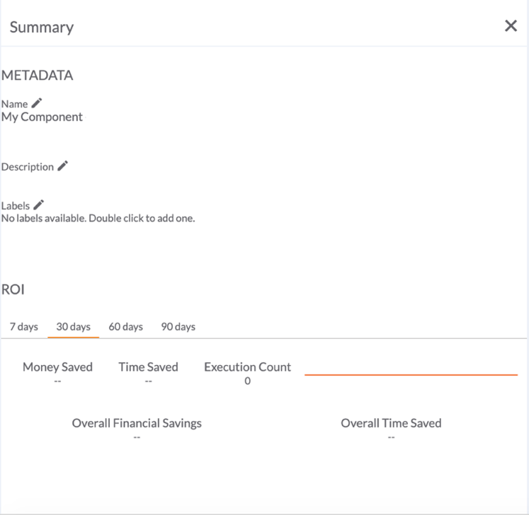
- Double-click the Component Trigger. The Edit Trigger pane will be displayed on the left side of the screen (Figure 5).
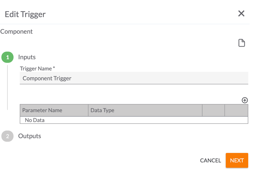
- Trigger Name: Enter a name for the Component Trigger.
- Click the plus
 icon to display the Create Parameter: configuration options (Figure 6).
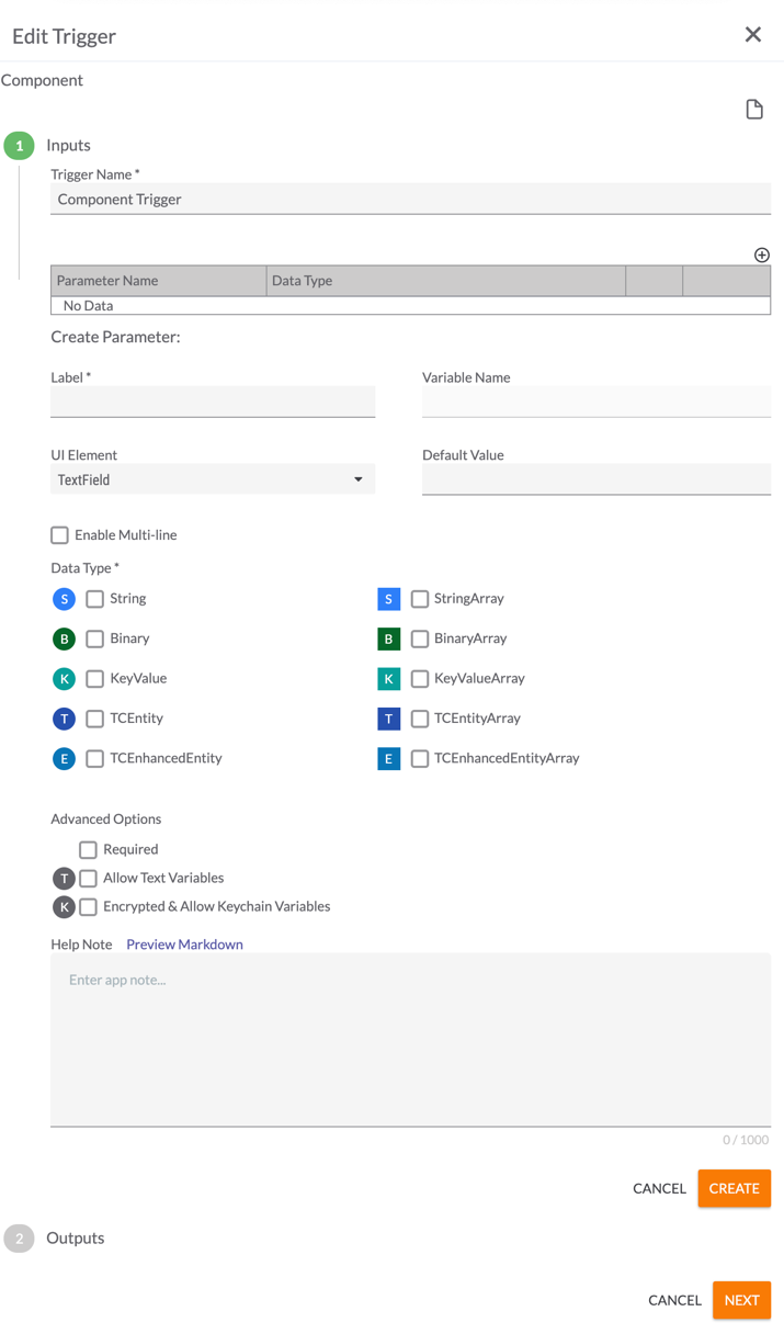
- Label: Enter a name for the parameter. This is the name that will be displayed in the Edit App pane of the Component when designing the Playbook that calls it.
- Variable Name: This field will autofill the name of the corresponding input variable for the parameter, based on the provided label. For example, if the label is “Sample Input Parameter,” then the Variable Name will fill as “sample_input_parameter”. This field cannot be edited.
- UI Element: Use the dropdown list to select the type of element (TextField, Editable Choice, Dropdown, Checkbox, Multiselect Dropdown, or Key/Value List) that will render for this parameter in the Edit App pane of the Component when designing the Playbook that calls it.NoteThe choice of UI Element will determine the rest of the fields in the Create Parameter: section that can be configured. For example, if the TextField element is selected, you can configure the Default Value, Enable Multi-line, Data Type, Required, Allow Text Variables, and Encrypted & Allow Keychain Variables options, whereas if the Checkbox element is selected, you can configure only the Default Value option, and all remaining options will be grayed out.NoteInternal variables such as ${OWNERS} (i.e., the list of all available owners in the your Organization) may be entered as a dropdown option so that you do not have to enter every element contained within the variable manually. In this example, users configuring the Component in a Playbook would see a list of all available owners in their Organization for the parameter.
- TextField (Figure 6)
- Default Value: Enter a default value that will be displayed for the parameter in the Edit App pane of the Playbook Designer when configuring the Component App, if desired.
- Enable Multi-line: Select the checkbox to display a TextField input field with multiple lines in the Edit App pane of the Playbook Designer when configuring the Component App.
- Data Type: Select one or more types of data that the parameter will take. These data types are the kinds of variables that users designing Playbooks that utilize the Component will be allowed to enter. The letter to the left of each selection provides a quick reference to the type of data, with the array versions of a data type having the same letter as the non-array versions (e.g., both String and StringArray are represented by “S”), but appearing in a square instead of a circle.
- Required: Select the checkbox to require the user to enter a value for this parameter.
- Allow Text Variables: Select the checkbox to allow text variables to be entered as values for this parameter.
- Encrypted & Allow Keychain Variables: Select the checkbox to enable encryption and allow keychain variables to be entered as values for this parameter.
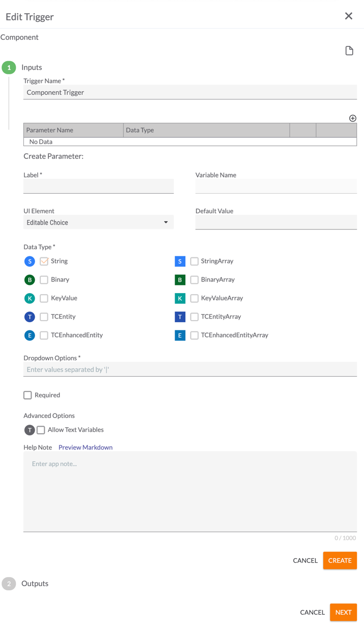
- Editable Choice (Figure 7)
- Default Value: Enter a default value that will be displayed for the parameter in the Edit App pane of the Playbook Designer when configuring the Component App , if desired.
- Dropdown Options: Enter pipe-delimited (|) dropdown options that users will choose from in the Edit App pane of the Playbook Designer when configuring the Component App.
- Required: Select the checkbox to require the user to select a value for this parameter.
- Allow Text Variables: Select the checkbox to allow text variables to be entered as values for this parameter.
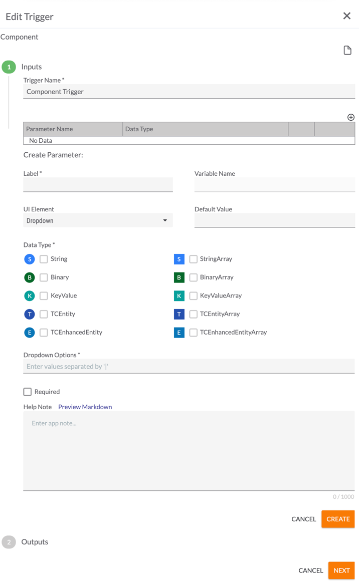
- Dropdown (Figure 8)
- Default Value: Enter a default value that will be displayed for the parameter in the Edit App pane of the Playbook Designer when configuring the Component App , if desired.
- Dropdown Options: Enter pipe-delimited (|) dropdown options that users will choose from in the Edit App pane of the Playbook Designer when configuring the Component App.
- Required: Select the checkbox to require the user to select a value for this parameter.
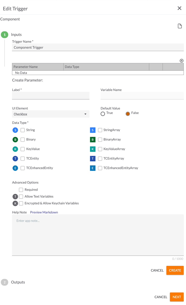
- Checkbox (Figure 9)
- Default Value: Specify whether the Checkbox parameter will be selected (True) or cleared (False) by default.
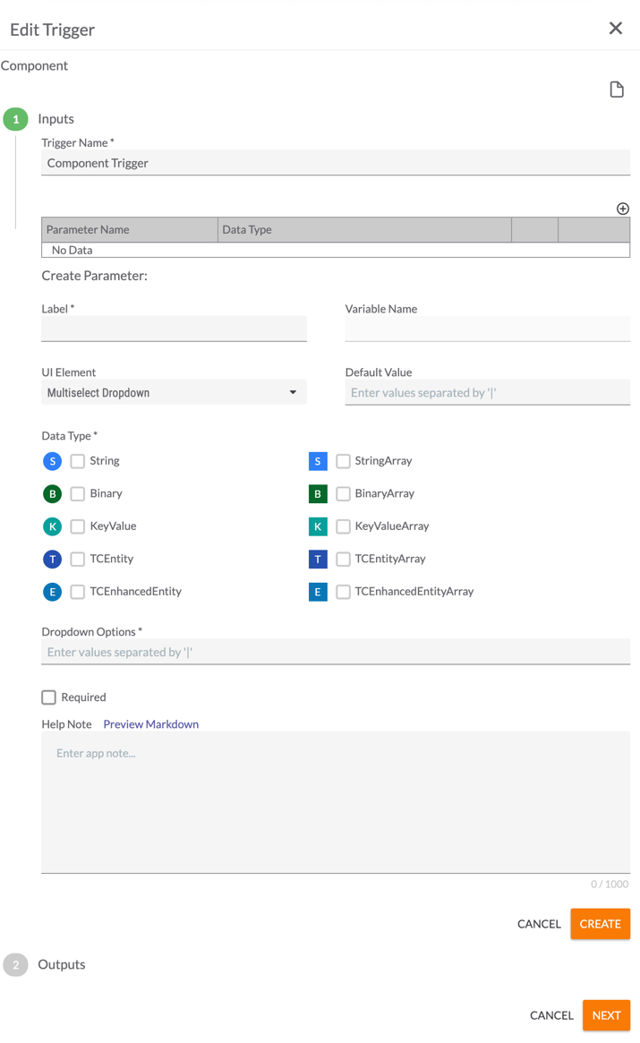
- Multiselect Dropdown (Figure 10)
- Default Value: Enter a default value that will be displayed for the parameter in the Edit App pane of the Playbook Designer when configuring the Component App, if desired. Multiple values separated by the pipe (|) character may be entered as default values.
- Dropdown Options: Enter pipe-delimited dropdown options that users will choose from in the Edit App pane of the Playbook Designer when configuring the Component App.
- Required: Select the checkbox to require the user to select a value for this parameter.
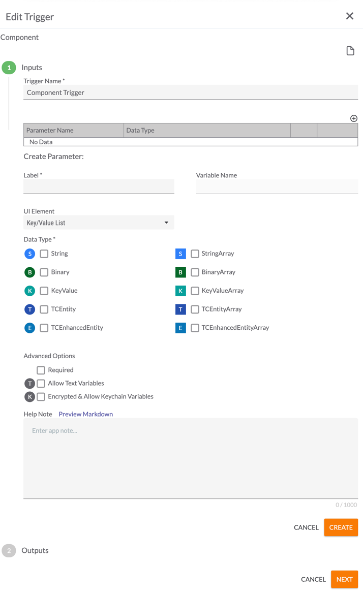
- Key/Value List (Figure 11)
- Data Type: Select one or more types of data that the parameter will take. These data types are the kinds of variables that users designing Playbooks that utilize the Component will be allowed to enter. The letter to the left of each selection provides a quick reference to the type of data, with the array versions of a data type having the same letter as the non-array versions (e.g., both String and StringArray are represented by “S”), but appearing in a square instead of a circle.
- Required: Select the checkbox to require the user to enter a value for this parameter.
- Allow Text Variables: Select the checkbox to allow text variables to be entered as values for this parameter.
- Encrypted & Allow Keychain Variables: Select the checkbox to enable encryption and allow keychain variables to be entered as values for this parameter.
- TextField (Figure 6)
- Help Note: Text entered here will be displayed in the Inputs section of the App Note, which is the text that is displayed when Display Documentation
 is clicked in the Edit App pane of the Playbook Designer when configuring the Component App.NoteDisplay Documentation
 displays a blank card when clicked, as users provide the parameter information for Components, so there are no pre-generated parameter notes to display.
 - Click the CREATE button.
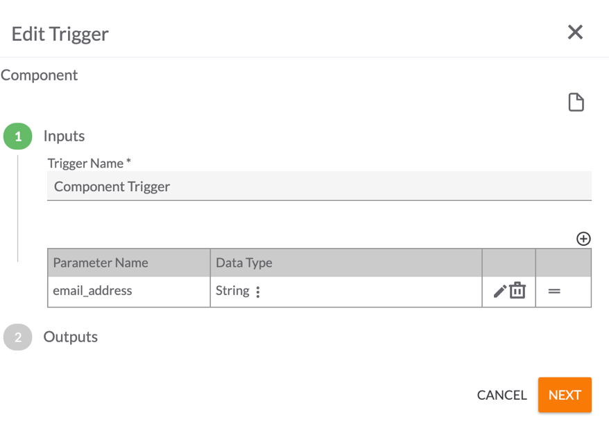
- The new parameter will be displayed in the table on the Inputs screen of the Edit Trigger pane (Figure 12).
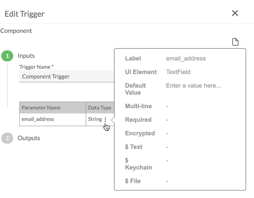
- Vertical ellipsis
 : Hover over this icon to the right of the value in the Data Type column to display a summary of the the parameter’s settings (Figure 13).
- Edit
 : Click this icon to edit the parameter.
 - Delete
 : Click this icon to delete the parameter.ImportantClicking Delete
 deletes the variable immediately. No window or message will be displayed to ask for confirmation first.
 - Move =: To reorder the parameters listed in the table, click this icon and drag the parameter to the desired location in the table.
- Vertical ellipsis
- Repeat Steps 6 and 7 to create and add information for all remaining parameters. Once you have created all input parameters, click the NEXT button. The Outputs section of the Edit Trigger pane will be displayed (Figure 14).
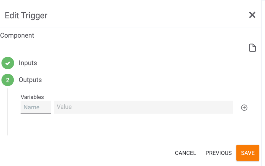
- Click the SAVE button without adding output variables. Output variables are used to pass information back to the Playbook that called the Component, but the list of potential values will first need to be populated by the Apps that connect to the Component Trigger. As such, the output variables must be added after all Apps are added to the Component.
- Add Apps and Operators to the Component in the same way that they would be added to a Playbook. It is good practice to connect the end of all possible pathways back to the Component Trigger so that it receives the final output from the pathway(s) the Component takes and can pass that information back to the calling Playbook.
- Double-click the Component Trigger to edit it again. In the Edit Trigger pane, click the NEXT button (Figure 12) to go to the Outputs section (Figure 14).
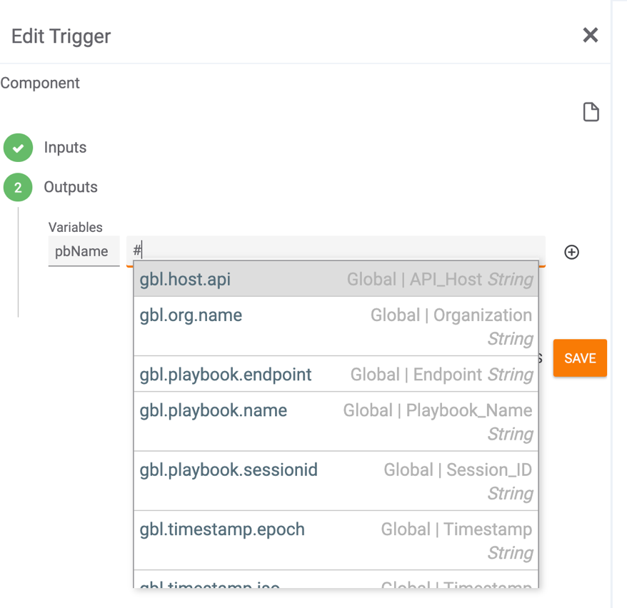
- For each output variable, enter a name in the Name field, and then type a hashtag (#) in the Value field to display a dropdown list of possible values (Figure 15). Choose a value from the list.NoteThe values provided will depend on the Apps in the Component.
- Click the plus
 icon to add the variable to the Trigger (Figure 16).
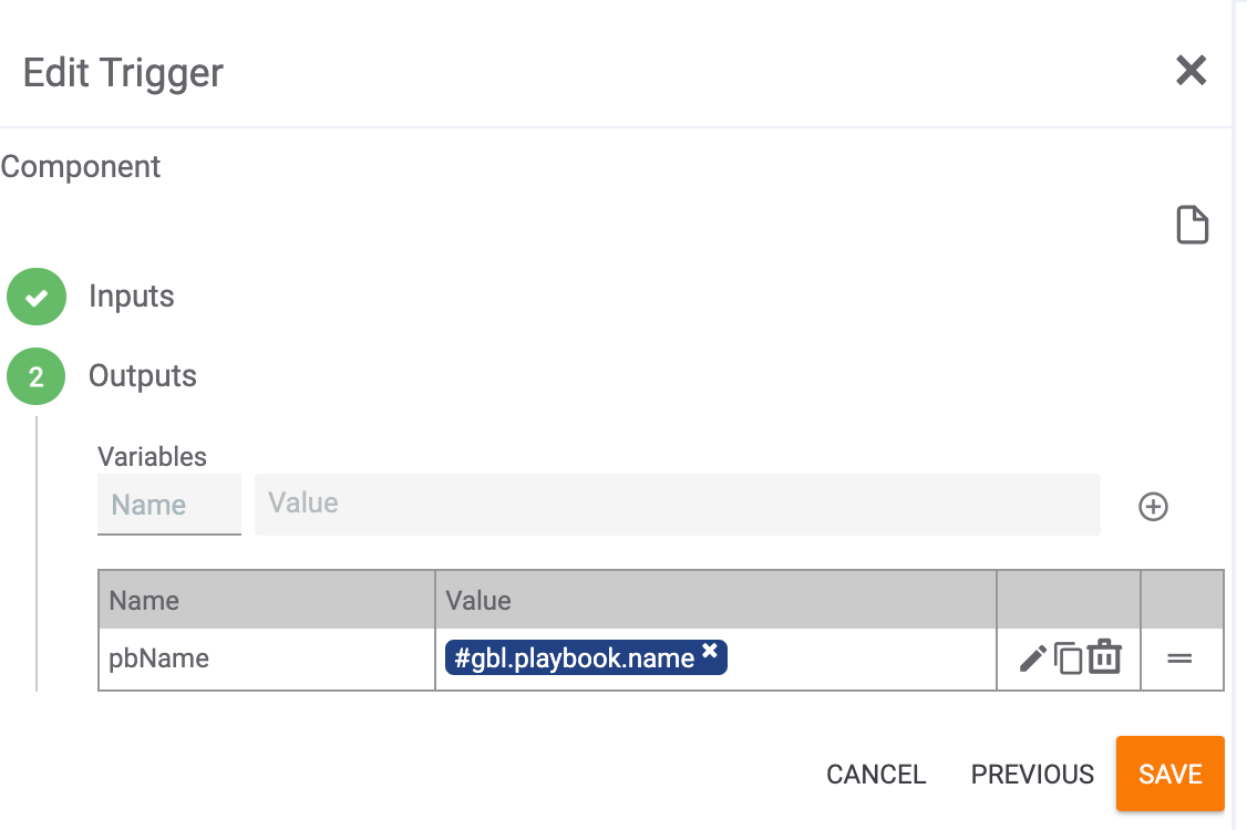
- Edit
 : Click this icon to edit the variable. When editing a variable, the Variables fields will populate with its name and value. Make the changes in those fields, and then click the checkmark or X icon to accept or reject the changes, respectively.NoteWhile editing a variable, the Edit, Copy, Delete, and Move icons will be disabled for all variables listed in the table.
 - Copy
 : Click this icon to duplicate the variable. A copy of the variable will be added to the table with the text “_copy” appended to its name (e.g., pbName_copy). This functionality is useful when you want to create a new variable based on an existing one.NoteIf you duplicate the same variable more than once without changing the first copy’s name, duplicate entries will be displayed in the table, an error notification will be displayed at the bottom left of the screen, and you will be prevented from saving the Playbook Component’s configuration until you change the name of all copies with the same name.NoteTo copy only the contents of a name or value field in the table, highlight the corresponding text and use your browser’s copy functionality (e.g., Command-C).
 - Delete
 : Click this icon to delete the variable.ImportantClicking Delete
 deletes the variable immediately. No window or message will be displayed to ask for confirmation first.
 - Move =: To reorder the variables listed in the table, click this icon and drag the variable to the desired location in the table.
- Edit
- Once you have entered all variables, click the SAVE button.NoteComponents may also be built by adding Apps before configuring any part of the Component Trigger (i.e., before adding input parameters). Once the Apps are all configured and the pathways are built, the Component Trigger may be configured in full (i.e., input parameters and then output variables).
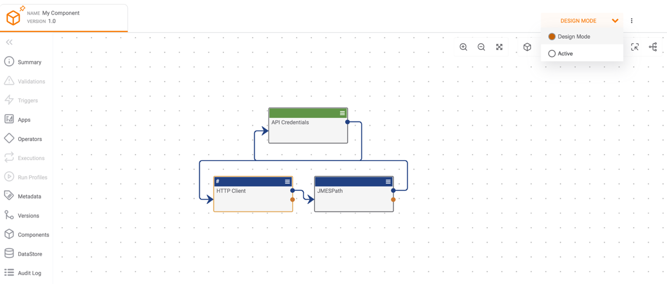
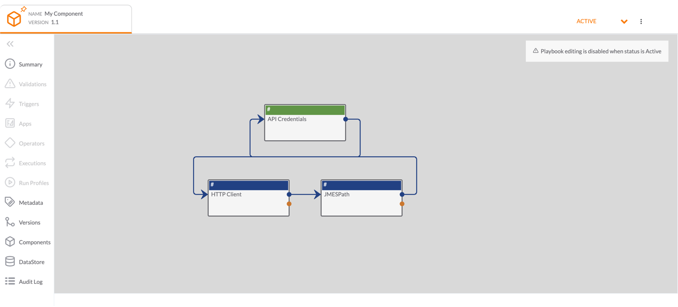
- Once you have fully configured the Component, hover over the Mode dropdown menu at the upper-right corner of the Playbook Designer screen and select Active (Figure 17). The Component will switch from Design Mode to Active (Figure 18).ImportantA Component must be active in order to be called by a Playbook.
 NoteApps and Operators within Components do not have an individual log level, and as such, there is no Log option in their menus. The log level for the Component as a whole can be set within the calling Playbook. In addition, the logging information for the Component is available within the execution and logging information for the calling Playbook.
ThreatConnect® is a registered trademark of ThreatConnect, Inc.
20069-02 v.08.B