Playbook Layout
There are two groups of icons at the upper right of the Playbook design pane (Figure 1).
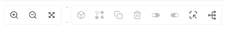
The group of three icons on the left side of Figure 1 provide options for formatting the view in the Playbook Designer:
- Zoom-in
 icon: Click this icon to increase the size of the Playbook elements.
 - Zoom-out
 icon: Click this icon to decrease the size of the Playbook elements.
 - Zoom-to-fit
 icon: Click this icon to resize the Playbook elements so that all elements fit fully on the screen at one time.
The group of eight icons on the right side of Figure 1 provides layout, group selection, and administrative options. Certain options require the use of the Select option before they become available.
Select
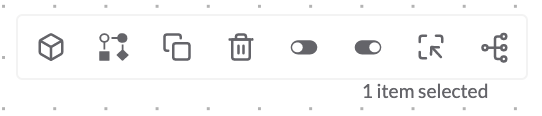
The Select icon allows multiple Playbook elements to be selected at one time using a drag-and-drop lasso. Click the icon and then drag and drop the cursor in the design pane to select the desired group of elements. Once one or more elements have been selected, several administrative options will become available for use, as distinguished by the icons changing from light gray (Figure 1) to dark gray (Figure 2).
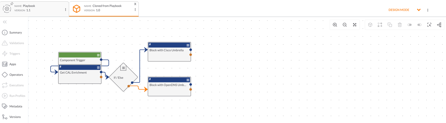
Build As Component
The Build as Component  icon allows elements within a Playbook to be cloned as a Component. The newly created Component will be opened as a tab in Design Mode with the App and Operator elements configured with the parameters, inputs, and outputs defined in the original Playbook (Figure 3).
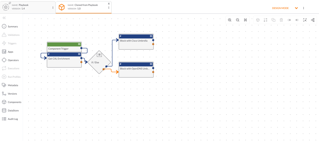
The Component Trigger that populates will need to be configured with the desired inputs and outputs. See Playbook Components for more information on configuring, activating, and using Components in a Playbook.
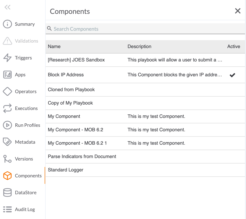
The Component will also show in the list of Components accessible in the original Playbook in the side navigation bar under  Components (Figure 4).
Build as Workflow
The Build as Workflow  icon allows elements within a Playbook to be cloned as a Workflow Playbook. The newly created Workflow Playbook will be opened in a tab in Design Mode with App and Operator elements configured with the parameters, inputs, and outputs defined in the original Playbook (Figure 5).
The Workflow Trigger that populates will need to be configured with the desired inputs and outputs. See Workflow Playbooks for more information on configuring, activating, and using Workflow Playbooks.
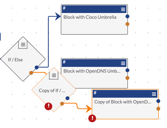
Clone Items
The Clone items  icon will clone any number of elements lassoed by the Select
  icon and display them within the existing Playbook design pane, retaining the original configurations. In Figure 6, only two elements were lassoed by Select. They are displayed near the original elements with the default name Copy of <original element name>.
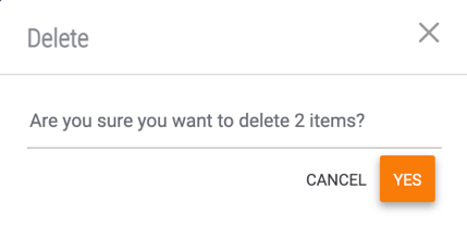
Trash
The Trash  icon enables you to delete multiple Playbook elements at one time. Once the elements have been selected, click the icon. The Delete window will be displayed, with a message showing the number of elements to be deleted (Figure 7). Click the YES button to confirm.
Disable Items
The Disable items  icon allows you to disable multiple Apps and Operators at one time to stop the Apps or Operators from executing as part of the Playbook. Once you click out of the Select feature, the selected elements will show as grayed out (Figure 8).
Enable Items
The Enable items  icon allows you to enable Apps and Operators that have previously been disabled from execution.
Auto-layout
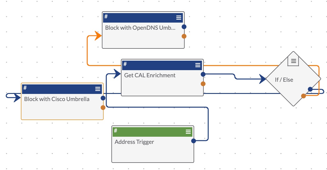
The Auto-layout  icon redistributes the Playbook elements to best represent the flow of Playbook logic. For example, the layout of the Playbook in Figure 9 is jumbled and confusing.
To arrange the elements in the most optimal configuration, click the Auto-layout  icon. The Confirm window will be displayed (Figure 10).
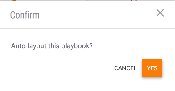
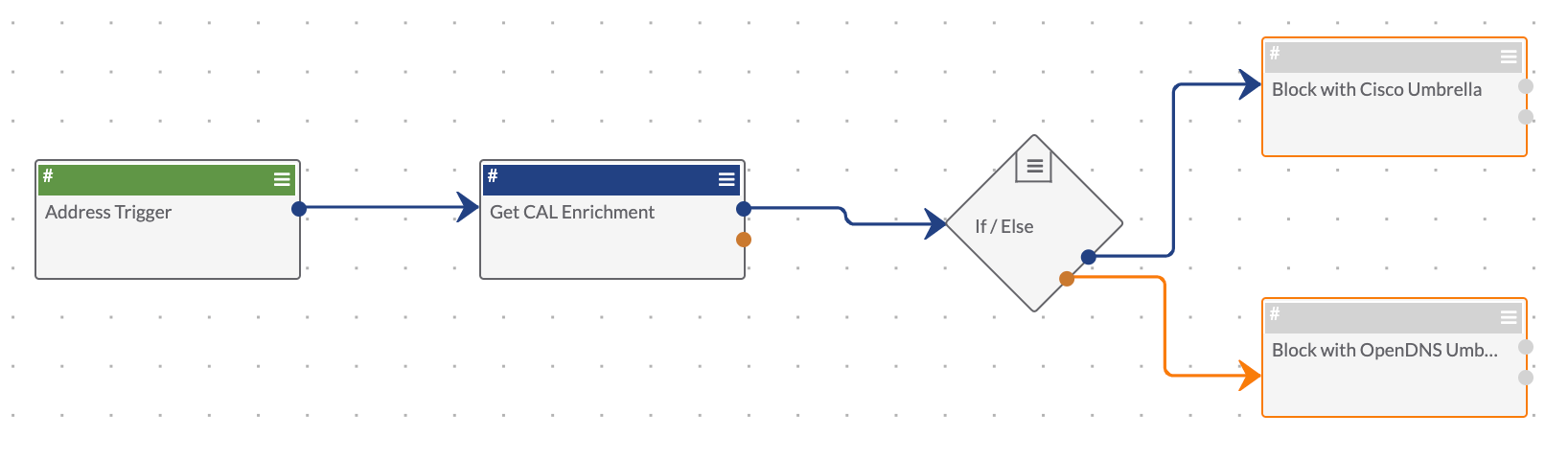
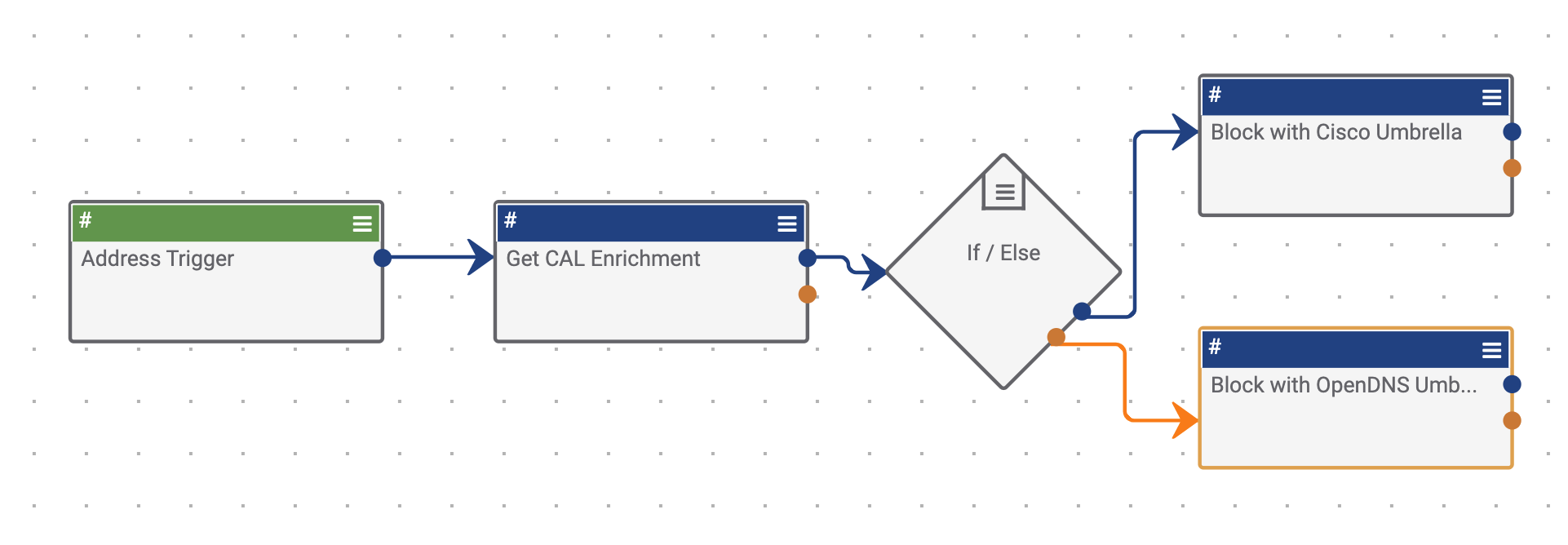
Click the YES button. The Playbook elements will redistribute on the design pane (Figure 11).
ThreatConnect® is a registered trademark of ThreatConnect, Inc.
20110-26 v.02.B