False Positives provides a graphical representation of the percentage of Cases that had their status set to Closed and resolution set to False Positive over a period of time.
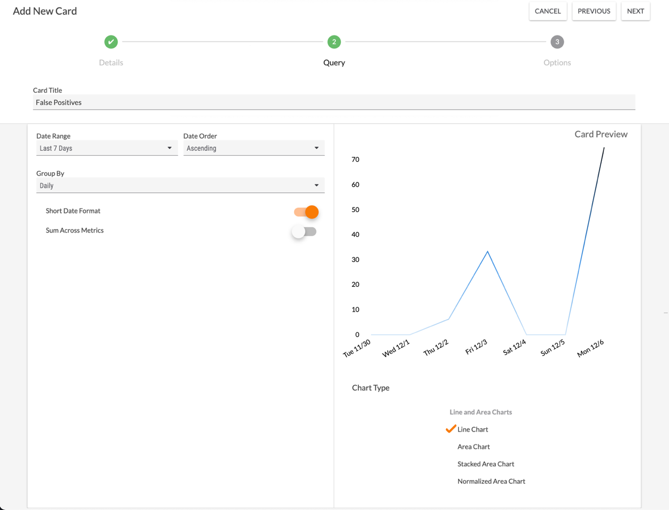
- Select False Positives on the Details step of the Add New Card drawer to display the Query step (Figure 1).

- Date Range: Select the period of time from which data will be displayed.
- Date Order: Select whether the dates displayed in the card should be in Ascending or Descending order.
- Group By: Select the desired grouping of dates displayed in the card. Available options include Daily, Weekly, and Monthly.
- Short Date Format: By default, dates are displayed on the dashboard card in short date format (e.g., Mon 12/6). Toggle this slider off to display dates in long date format (e.g., Mon December 06).
- Sum Across Metrics: The Sum Across Metrics toggle has no effect on this dashboard card.
- Card Preview: This section displays a preview of the card.
- Chart Type: Select the type of chart to display.
- Click the NEXT button at the upper-right corner of the screen.
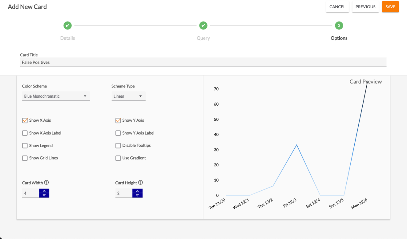
- The Options step will be displayed (Figure 2). Here, you can customize the look of the False Positives dashboard card.

- Color Scheme: Select the color scheme for the card.
- Scheme Type: Select whether the color scheme should be Linear or Ordinal.
- Show X Axis: Select this checkbox to display the x-axis of the chart. This checkbox is selected by default.
- Show X Axis Label: Select this checkbox to display a custom label for the x-axis. After you select the checkbox, a text box will be displayed where you can enter the desired label.
- Show Legend: Select this checkbox to display a legend for the chart. After you select the checkbox, a text box will be displayed where you can enter a label for the legend.NoteThe four False Positives chart types (shown in the Card Preview section in Figure 1) do not display a legend’s label, so the value entered in the text box will not be displayed in the dashboard card.
- Show Gridlines: Select this checkbox to display gridlines on the chart.
- Show Y Axis: Select this checkbox to display the y-axis of the chart. This checkbox is selected by default.
- Show Y Axis Label: Select this checkbox to display a custom label for the y-axis. After you select the checkbox, a text box will be displayed where you can enter the desired label.
- Disable Tooltips: By default, a tooltip is displayed whenever you hover over a piece of data on a dashboard card chart. Select this checkbox to disable this feature for the dashboard card.
- Use Gradient: A gradient effect is applied to the four False Positives chart types by default, so selecting the Use Gradient checkbox has no effect on this dashboard card.
- Card Width: Enter a number for the card’s width. The default width of a card is 4, and the maximum width you can set for a card is 16.
- Card Height: Enter a number for the card’s height. The default height of a card is 2, and the maximum height you can set for a card is 5.
- Click the SAVE button at the upper-right corner of the drawer. The False Positives card will now be displayed on the dashboard.
ThreatConnect® is a registered trademark of ThreatConnect, Inc.
20118-05 v.03.B